nopetnoget

← Back to the project card

EasyFill.ai review: what we found in testing

Author: nopetnoget editors ·

Test scenario

Step 1

Is it clear in 10 seconds what the product does and who it’s for?

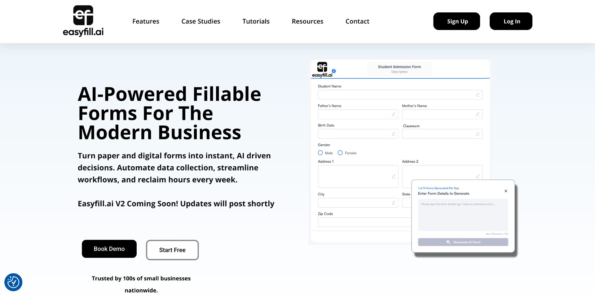
There is some ambiguity on the homepage. The first screen talks about generating beautiful forms with AI, but then the focus shifts to converting PDF files into beautiful and convenient online forms using artificial intelligence. This should be the key message for users on the first screen. You can also move the video demonstrating how the project actually works to the very top—it's an excellent video and a great way to show clients the essence of the service in one minute without talking. Once users scroll further down the page, they get plenty of information about what the service offers and how it works. That's a plus—it just needs to motivate visitors to scroll down. The team is trying to sell the service or registration not only through the "Free Start" CTA button but also through a Demo session booking with David Smith. This option looks visually more appealing.
Is it clear in 10 seconds what the product does and who it’s for?

Step 2

How many sign-up steps are there, and is a card required immediately?

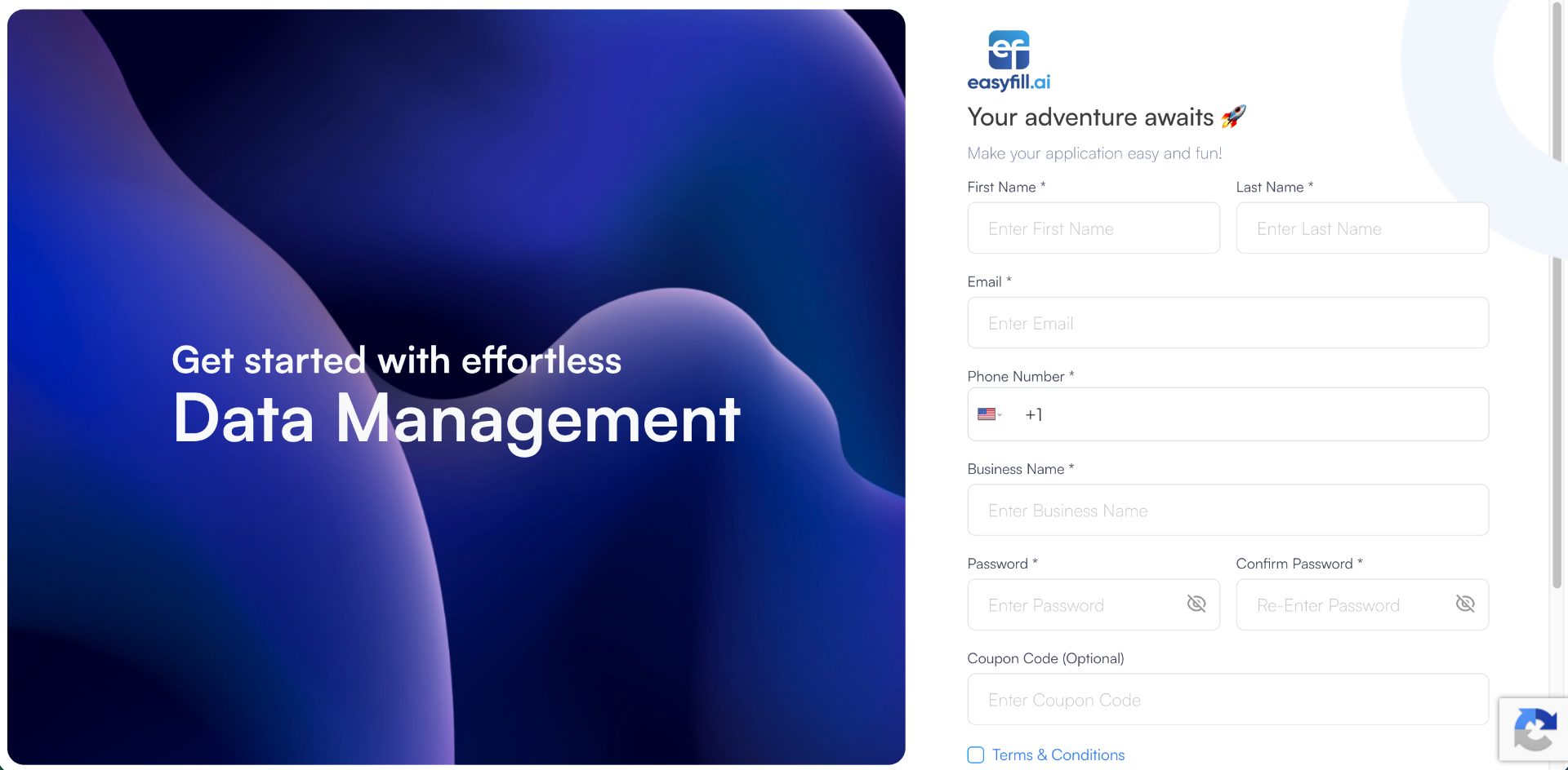
Registration is available through two scenarios: a custom registration form (actually overloaded with mandatory fields) and Google Auth, which can easily be missed because it's hidden below the fold on the registration page. We didn't want to go through full registration with personal data submission, but we had to. Even after Google registration, you're still asked for your phone number, name, and company name. We entered a fake phone number that doesn't exist because there were too many digits—but it let us register anyway. There's an attempt to "sell" the service right on the registration page, but we didn't see a relevant headline or description of benefits. The general headline "Data Management" doesn't appeal much and doesn't show the project's strong point. After registration, you're immediately offered to choose a plan. There's a free 21-day trial without needing to enter a card, which the project team also failed to mention on the page.

How many sign-up steps are there, and is a card required immediately?

Step 3

Are newcomers guided, or dropped into an empty interface?

The project's onboarding ends almost before it starts after we chose the free trial. You're redirected to the Dashboard page without any hint about what to do next. On the Dashboard page, there's only one button in accent blue—hard to miss. After uploading a random file from the PC, the system starts generating a form. The transformation takes no more than 20 seconds for a single-page file.

Are newcomers guided, or dropped into an empty interface?

Step 4

How long from “Get started” to the first useful result?

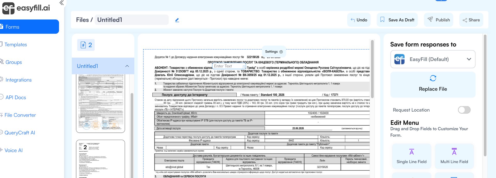
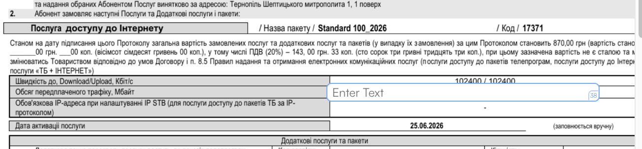
As a result of very quick onboarding, you get a confusing view—not really a form, just the same PDF file where you need to manually create your own form on top of it. Or we misunderstood how it works. Based on our expectations, we should have received a proper form that could be published in one click. We couldn't view the form or publish it—the Publish button was inactive with no warning. Essentially, we didn't get any "first value" except a not-so-friendly form builder overlaid on a PDF file. When we saved our form as a draft, the Publish button became active (we discovered this by chance), and we were able to publish the form for everyone. We also couldn't find any settings to restrict access rights to the form. Time: 1:55

How long from “Get started” to the first useful result?

Step 5

Does the product work on a different task beyond the demo case?

For the second scenario, we chose the form generation from a prompt option. We wrote a short prompt without much detail, and the system quickly generated a not-very-friendly and somewhat poorly adapted form for different screens. Publishing went without restrictions as in the first case. We entered the prompt in Ukrainian, but the form was generated in English. Using the builder, you can edit the titles and captions in it. The form doesn't contain required fields, and the service didn't deem it necessary to highlight this. When submitting the form, you're asked for an email—we entered our registration email, and the form submitted successfully. We found the response we submitted to this form through random clicks. When submitting, we had a signature upload and an image—everything was saved. We made 2 submissions with the same email, and no restriction on resubmission with the same email appeared. In the account, you can get confused about which submission was the last one if they were made on the same day from the same email. The interface isn't convenient. We didn't find options to style the form—all forms look the same.

Does the product work on a different task beyond the demo case?

Step 6

Where does the free plan end, and what breaks on unusual input?

You have 21 days and 3 free forms. This is a sufficient level for testing the product's value. You'll be reminded that you have a free version by a small cloud in the top right corner.

Where does the free plan end, and what breaks on unusual input?

Step 7

On the payment screen, is it clear what you are paying for?

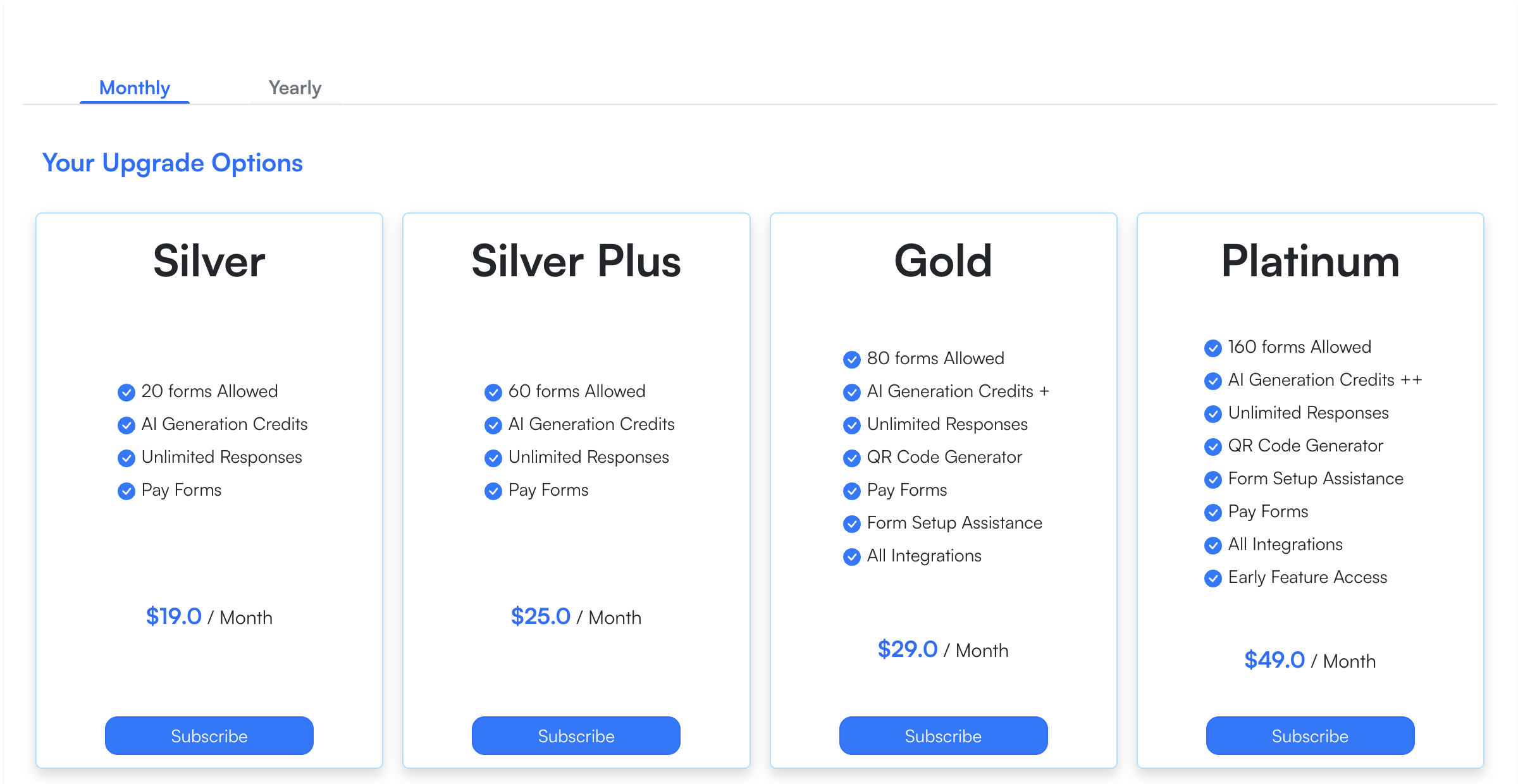
We consider the pricing for such a service excessive. You have access to 4 paid plans on a subscription model. From $19 to $49 per month with monthly commitment and $185–$499 per year. The main difference between plans is the number of generated forms. From 20 to 160 forms respectively. In our opinion, it makes sense to try selling not a subscription, but a paid form for $2, reducing the form cost based on the number of published/purchased forms. Payment is made through Stripe, and billing is available in the account. On all plans, you can connect your own Stripe and create a form with payment capability. This is a nice bonus or key feature compared to other popular and free form builders.

On the payment screen, is it clear what you are paying for?

Step 8

How do you unsubscribe, delete the account, and export your data?

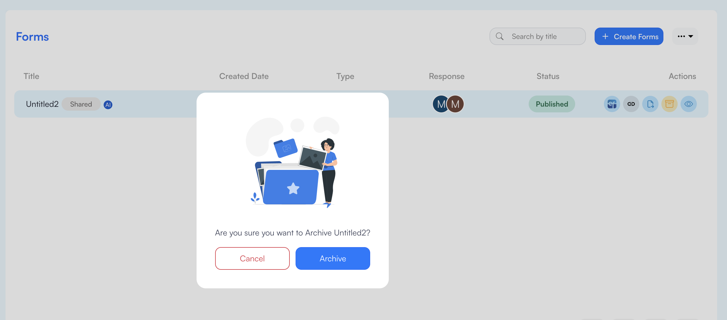
You have access to your profile and can change your personal data. We couldn't delete the account. We could only delete a form that had no user responses. Overall, this is acceptable mechanics and understandable behavior. A form with responses can only be archived. The interface itself seemed not very convenient, but we didn't encounter any errors during its operation.

How do you unsubscribe, delete the account, and export your data?

Three focus questions

Focus 1

How clear is the product onboarding?

Onboarding ended almost before it began. What to do after registration (which should definitely be simplified) is unclear to the user. There are video tutorials, but you likely won't watch them. To the founder: Work through the first entry and user adaptation to the Project Dashboard. Provide ready-made file and form examples directly in the user's account with hints on what to do next.

Focus 2

Is the pricing logical?

In our opinion, it's worth considering launching a pay-per-form option. Subscriptions look very expensive if you only need to create 1-2 forms, which could be a basic scenario for the project's target audience. To the founder: Reconsider the pricing structure. Think about switching to a pay-per-form model where each form is charged separately.

Focus 3

Does the product fit the stated audience?

We never figured out who the project is for. If it's for users who need to quickly convert PDF surveys into interactive forms, the quality of such transformation leaves much to be desired. For simple form generation from a prompt, there's also no competitive advantage. To the founder: Clearly define the project's target audience and emphasize the benefits for that audience.

Takeaways

01 What worked Service speed.
02 What annoyed Form UI/UX, unjustifiably complex registration, transformation and form generation quality, form generation not in the prompt language.
03 Who it’s not for Users who want to get a visually appealing form or a form with personalization elements.
04 Fix first Registration and onboarding. Simplify the form and emphasize the ability to register via Google Auth.

← Back to the project page