nopetnoget

← Back to the project card

Webetti review: what we found in testing

Author: nopetnoget editors ·

Summary

For users satisfied with a simple templated monolingual website. We did not gain a clear understanding of the project's target audience during testing, and the project team also provides no hints about who exactly their solution is for.

Verdict: 5/10. The project needs rethinking; in our opinion, the MVP is not validated. First thing to do: Remove the empty instructions section marked Coming soon.

Test scenario

Step 1

Is it clear in 10 seconds what the product does and who it’s for?

The first screen is quite simple and clear – the question: What website do you want to create? An open textarea for entering your prompt, preceded by a brief and clear explanation that Webetti creates websites using AI. You can start generation before registering.
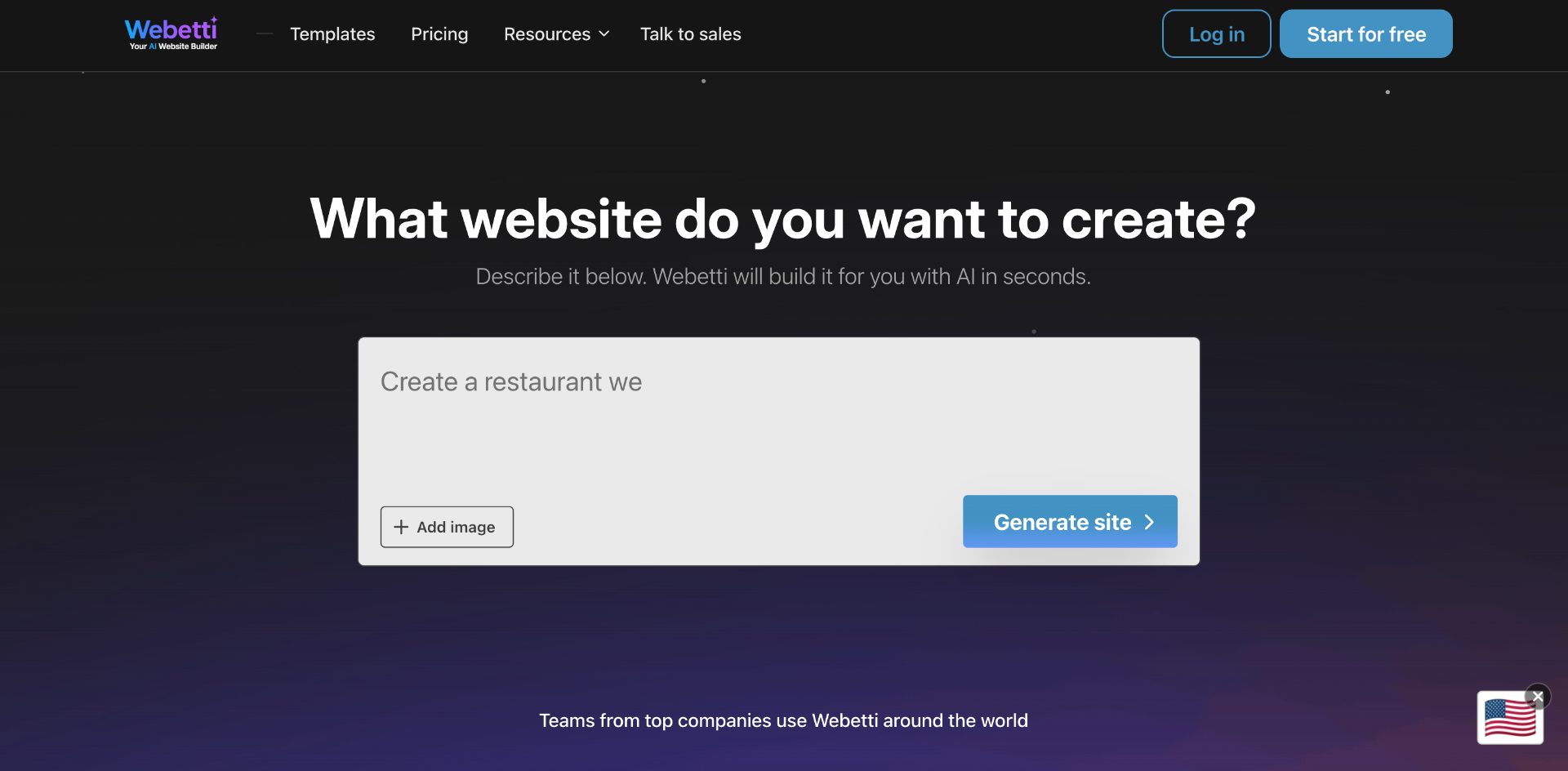
Is it clear in 10 seconds what the product does and who it’s for?

Step 2

How many sign-up steps are there, and is a card required immediately?

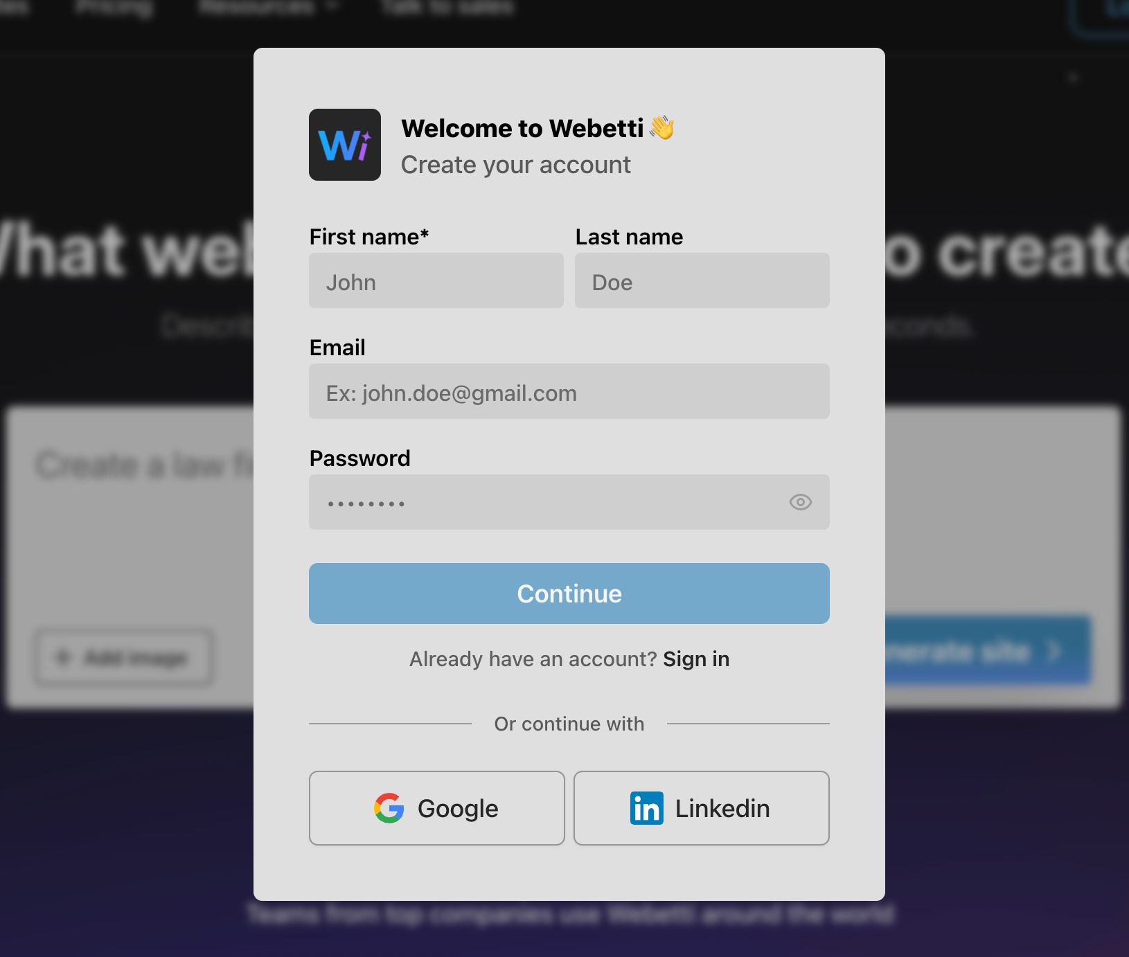
A registration form window appears from time to time, registration is available via Google Auth, LinkedIn, and directly to the database using email and password. The emphasis is on this registration option, but there should be no problem with the choice; the form is easy to read. During our test, we registered using Google Auth. The permissions level is standard: email, name, and avatar. After registration, you are returned to the home page, but instead of login and registration buttons, a Dashboard button appears. You will be constantly reminded about your free plan by an information block at the top of the page in a contrasting color: Click to start your free trial and unlock all features. Everything is implemented very simply, but intuitively clear; pages work without reloading, authorization happens instantly, which even confuses the user a bit since no action seems to happen.

How many sign-up steps are there, and is a card required immediately?

Step 3

Are newcomers guided, or dropped into an empty interface?

No onboarding or help. Just the home page and a prompt form. After input and submission, generation of your website begins, with steps displayed on the page as the model progresses. It's unclear how much this costs or whether you can do it endlessly. There's also a missing instruction on how to write a prompt to get the best result. There's an attempt to create such a section for those who value predictability, https://www.webetti.com/tutorials, but it's Coming soon. On the positive side, there's a consistent link in the header – Contact sales department, which leads to Calendly where you can book a meeting with a project manager. Again, everything is extremely simple, which suggests the project is still searching for its core service and "killer" feature. Active MVP model validation is ongoing.

Are newcomers guided, or dropped into an empty interface?

Step 4

How long from “Get started” to the first useful result?

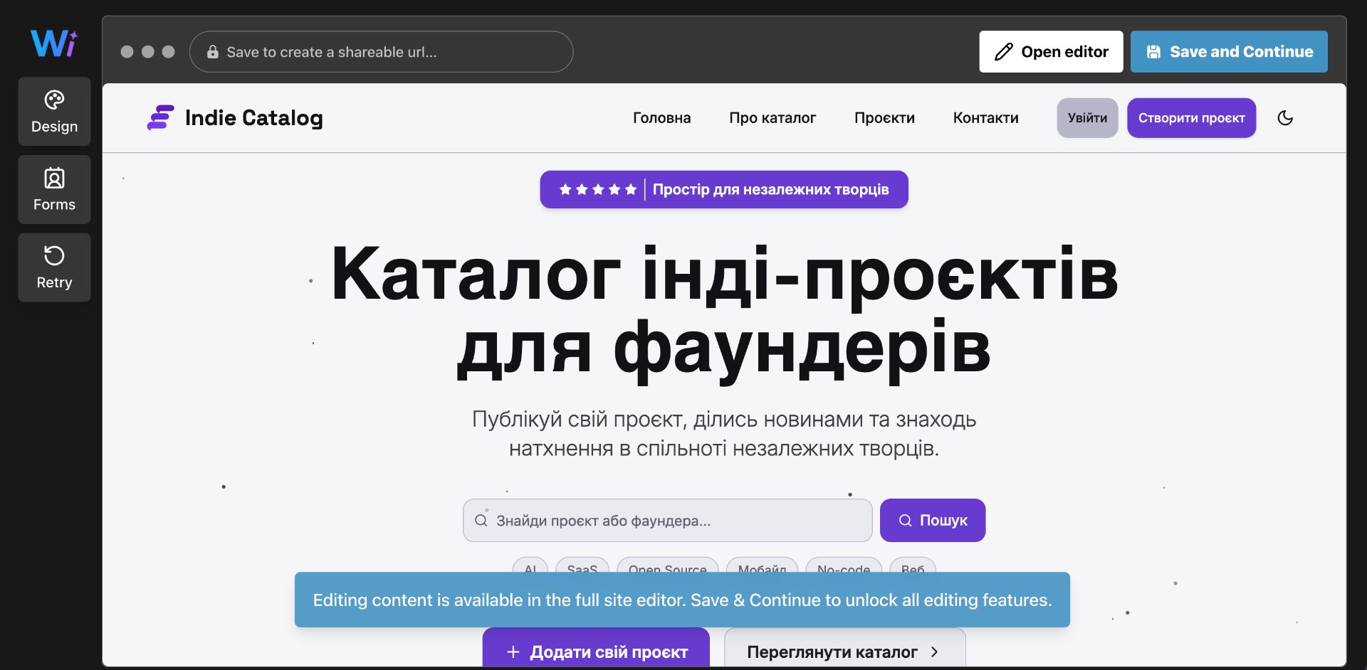
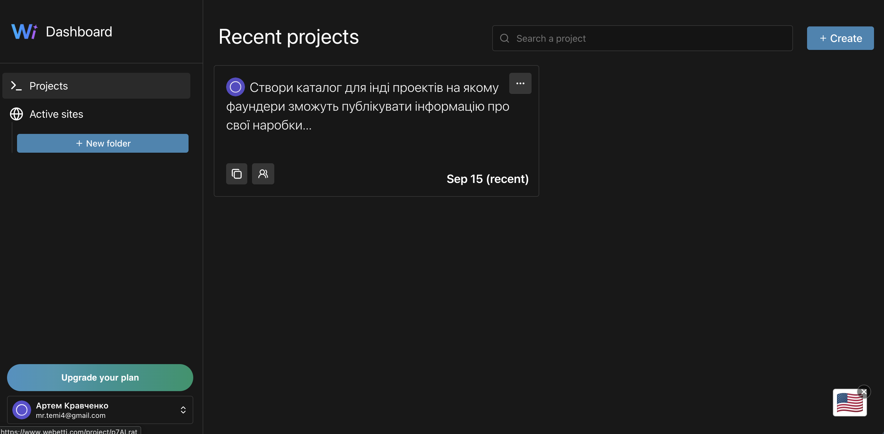
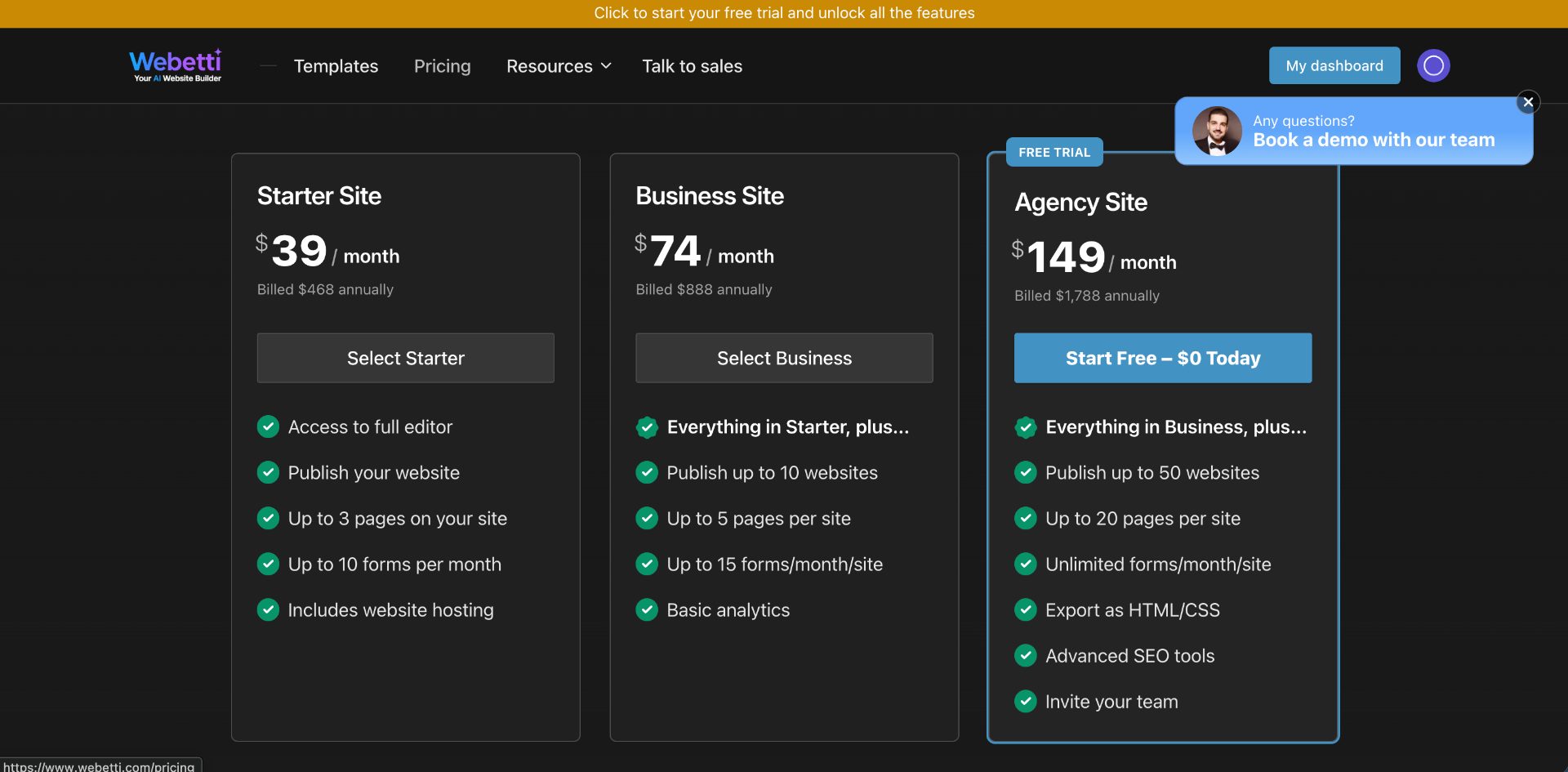
On the positive side, we managed to get first value within minutes without registration. But once we completed registration, we had to recreate everything from scratch because the previous version wasn't saved. The generated website itself is very simple and templated; there is no builder or special component editing mode for the site. In fact, you only have the ability to change text and adjust the project's styling a bit: corner radius, colors, etc. An additional option is the ability to specify an email address for the contact form; by default, your registration email is used. While testing this section, we immediately couldn't find how to preview the generated website on all device types: from desktop to mobile phones. But when trying to delete the generated website, we accidentally landed on such a page by simply clicking on the project card in the dashboard. When trying to save your result, you are immediately offered to choose a paid subscription, with the minimum price being $49 per month or $39 with annual commitment. Payment via Stripe. After this, the project team promises you will have access to all generation features and website management capabilities, but they don't specify what options exactly you'll get. Time: 3:37

How long from “Get started” to the first useful result?

Step 5

Does the product work on a different task beyond the demo case?

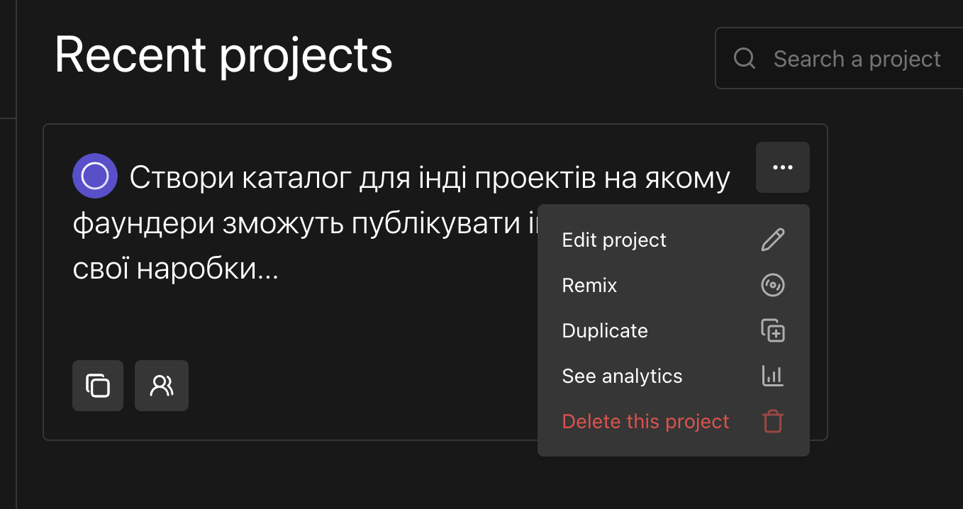
You can get a second scenario, but it won't display in your dashboard; you need to sign up for at least a $74 per month plan with annual commitment – $888 per year. The generated result is almost the same as the previous one. Although for generation we asked the model to create completely different projects: a website for a nanny in Spain and a catalog of indie projects for founders worldwide. We entered prompts in Ukrainian and English in two different cases; as expected, in the first case with the founders portal we got a monolingual website in Ukrainian, in the second variant monolingual – in English, despite the fact that we asked the website be made for a business in Spain. Time: 0:26

Does the product work on a different task beyond the demo case?

Step 6

Where does the free plan end, and what breaks on unusual input?

On the free plan, you have no limits on the number of generation attempts; we didn't notice any. But you cannot save the generated website in your dashboard to return to it later. This is frustrating. Essentially, you can work with 1 project without the ability to finally publish it even on the service's subdomain. The limit for when you need to switch to a paid plan comes very quickly.

Step 7

On the payment screen, is it clear what you are paying for?

Pricing is as simple as possible. First, you only have annual or monthly subscriptions available. The plan affects the number of websites and forms. For users of the top plan, the team declares the ability to export the website as html/css. Prices range from $39 to $149 when paying for 12 months upfront; monthly payment will be about 20% more expensive for customers. In our opinion, the cost of the solution is overpriced; free models provide better results for less money.

On the payment screen, is it clear what you are paying for?

Step 8

How do you unsubscribe, delete the account, and export your data?

You won't be able to delete your account; managing your subscription plan is also questionable – whether you'll be able to cancel it remains a guess. From available deletion options, you can use deletion of the generated solution.

How do you unsubscribe, delete the account, and export your data?

Three focus questions

Focus 1

How clear is the product onboarding?

There is no onboarding, and we found no instructions or tutorials on how to use the service. Yes, the project looks very simple and you don't need to go through a complex path to get "first value," but no one will hold your hand through it. To the founder: Hide or complete the instructions section. Add prompt examples to achieve the highest generation quality.

Focus 2

Is the pricing logical?

The pricing is fine, at least in terms of how it's perceived. Everything is transparent and as simple as possible. But the value and its cost are questionable. During our short testing period (~3 hours), we were not ready to sign up for a subscription. While testing, we had the impression that better results could be obtained using free popular AI models. To the founder: You need to confirm the product's value and highlight key advantages over popular free or even paid AI models at $20 per month.

Focus 3

Does the product fit the stated audience?

The project team does not specify who exactly their product targets. From our perspective, the target audience is very blurry, and the generation level is very superficial. The product first needs to understand and show its value and competitive advantage, rather than search for its audience. To the founder: Clearly specify who the project is for and what exactly the target audience will receive, what advantage they'll gain.

Takeaways

01 What worked Generation speed, dashboard responsiveness. Simplicity.
02 What annoyed Generation quality, paid plans without confirmed value that seem overpriced, and sometimes unclear dashboard UX where you have to guess about certain service features.
03 Who it’s not for Those who first and foremost need a high-quality personalized website.
04 Fix first Remove the empty instructions section marked Coming soon.

← Back to the project page